Monday, May 16, 2011
Polaroid effect
I liked this project because it was mainly dragging and copying. I found pictures of food from my favorite restaurant and added strokes to the outside. I didn't have to do this for every single picture because I just dragged the effects to each photo. I added a color scheme in the background, the logo, and the text. I added a little drop shadow to the text to make it stand out a bit more.
Curling type around objects
This project is really a whole bunch of different projects compiled into one. First I had to curl the type around the little sample bottle which you do by choosing the shear option and dragging the point to the left to give it a little curl. You do the same thing to the other text and make it a little opaque. Drag this to a picture of whatever you want on the ad and add text. I think this turned out really nice.
Elegance with trancparent type
This project just requires knowing how to add effects to text. I only had two layers when I was finished with this project. First, find an image of whatever you want to "add elegance" to. Then choose stroke to add a border around the outside. From there, you type whatever word you want and then flip it so it goes up & down (if you want). Change your foreground color to white and then press option-delete to fill the text with white. Then, in the layers palette, chance the opacity to around 35%. You can add whatever you want to the bottom of the picture to complete the project.
Carved wood type
This project took a while because there were so many different steps. First you make a custom gradient with browns. You pick the radial gradient and you click and drag from the center to the top of the background layer. Then you add noise and choose gaussian blur. Then you add a motion blur and unsharpen the mask. Then you type the word you want to have this effect and you add "sprayed strokes" to the text. You then select all letters and press delete to knock out the color from it. Then you choose inverse, add a drop shadow and any other effects you want.
Brushed metal
The brushed metal effect is really simple if you're familiar with photoshop. All I did was use a picture that was wanted in the add and change the canvas size to have room for the text at the bottom. Then I added a rectangular box and filled it with a gray gradient. From there I added noise and messed with the color levels. After the noise I added motion blur which made it look like metal, but to smooth it out I fixed the Bevel and Emboss. I then added text and the picture of the monitor.
DVD Menu
This project required me to use about four different photoshop steps and prior knowledge of photoshop. I first took a picture of a movie I wanted to do, (I chose The Notebook) and then I added a blue tint and a grain to the picture, because it was going to be my background. Then I made four separate circles that were all the same size and pasted into them. I chose 4 different scenes from the movie. Then I added a little outer glow to each circle and voilà!


Wednesday, May 11, 2011
Putting an image in a monitor
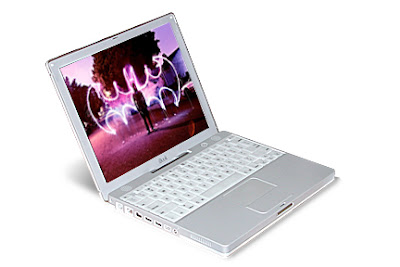
This technique just made me for familiar with the Free Transform tool. I wanted to find a really cool image and I think this one looked really neat. This photoshop technique isn't a one-time thing, you'll use it throughout photoshop. First I found this image, brought up the free transform tool, and then I held the command key and dragged each corner by itself to fit into the monitor.
Putting one image inside another image
This effect is really popular in catalogs and adds. All you do is take an existing photo into the screen of a product and transform it to fit just right. This is popular because electronics or anything with a screen doesn't really photograph well. I took the photo I was using first and transformed it into the cell phone, added a drop shadow, and that step was done. The orange part at the bottom is just a simple shape filled with orange and the background is the same photo in the phone, but I desaturated it and made it more opaque. I added some text found regularly in cell phone adds and the logo for Fictitious Wireless was a custom shape already on photoshop.
Business card
 |
| Back |
 |
| Front |
Stamp
 |
| Original |
 |
| Final |
Photoshop was a big help in this project. It cut out the stamp edge holes all by itself and it looks really good. It was difficult deciding what to put into the stamp but I figured Marilyn Monroe would be a good choice. I added the price of the stamp and also a drop shadow to the background of the entire stamp. The edge is kind of thick, but oh well.
Tuesday, May 10, 2011
Perspective shadow
I feel like this project turned out really neat. The perspective aspect of it makes it look really cool, and Tormented is just the word for it. I lined up the shadows really well and the gradient looks really good.
Wrap text around globe
Aqua Sphere
Monday, May 9, 2011
Clipping mask effect
3D type
Picture in word
Using one photo as the background and the focal point
Shadow
Motion Blur
Colorize
 |
| Original |
 |
| Final |
Friday, May 6, 2011
Reflection
Subscribe to:
Comments (Atom)


